
Start with an assessment

Product website, UX system and application interface

Relationship
Implementation partner · Product website and UX system by Colorbull
Disciplines
PRODUCT · UX · WEB · APPLICATION
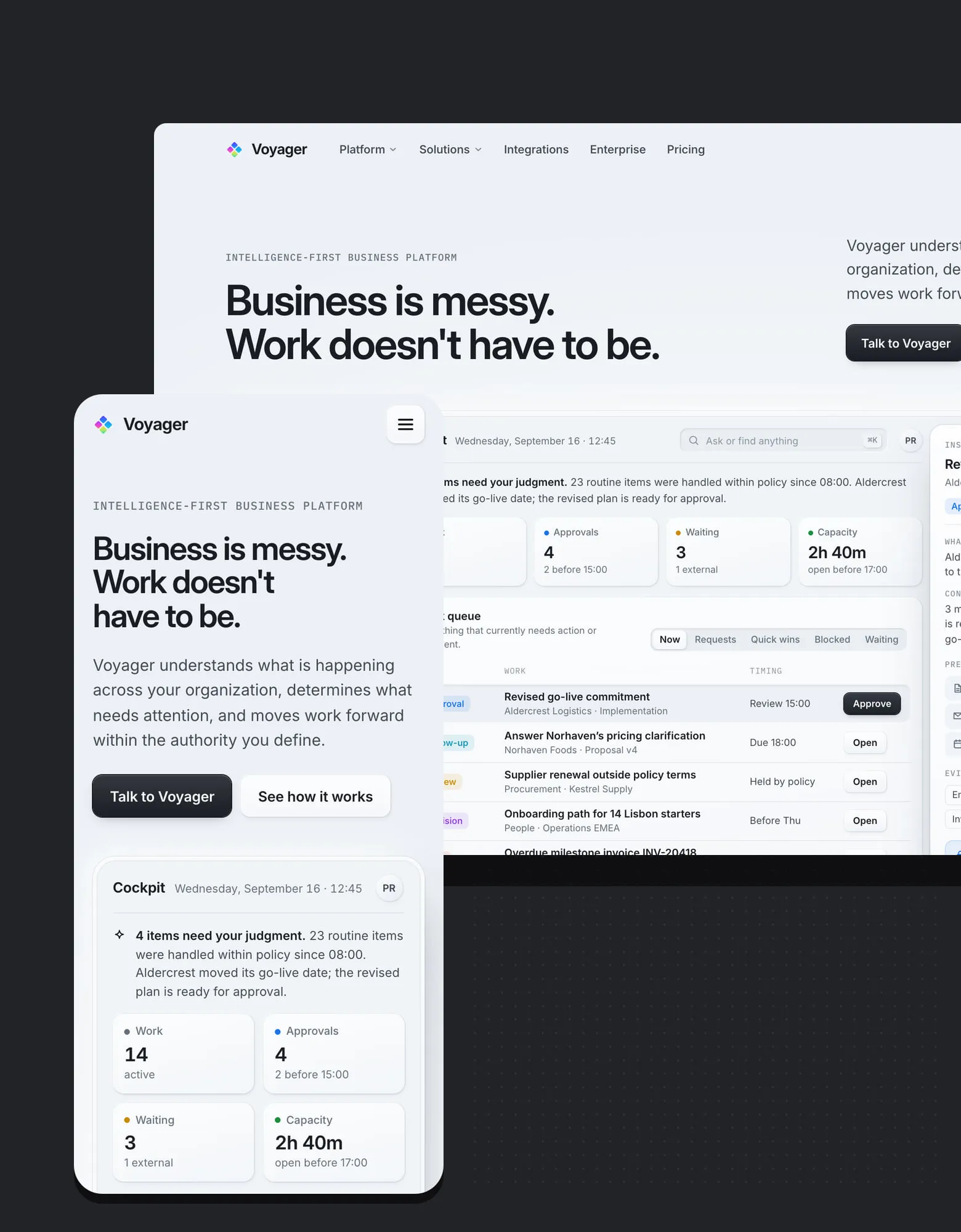
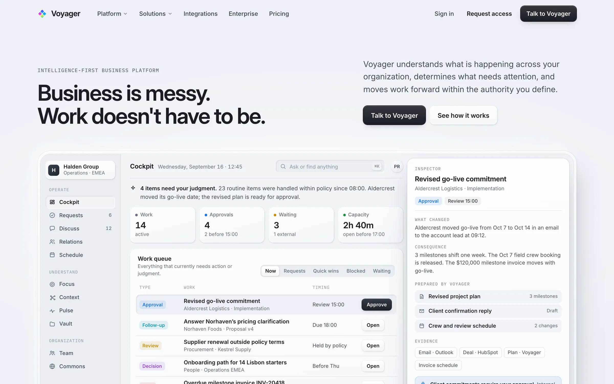
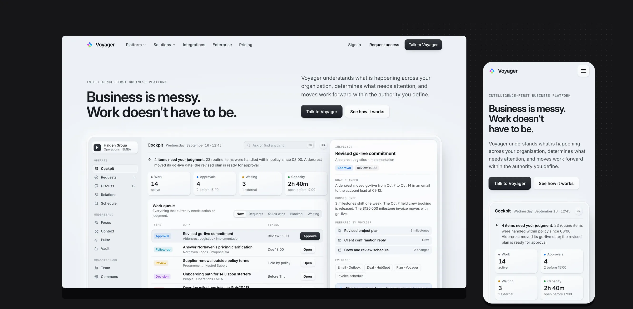
Voyager homepage on desktop showing the product cockpit with work queue, approvals and an inspector panel, beside the mobile layout.

Business context

Voyager is an intelligence-first business platform. It understands what is happening across an organization, determines what needs attention and moves work forward within the authority the organization defines, working across the systems a business already uses, or replacing them natively when the business chooses to consolidate.

Colorbull also uses Voyager in its own delivery operation. That makes this project unusual: the website had to sell a product Colorbull depends on every day, to buyers who are right to be skeptical of AI claims.
What needed to change

The product is broad, work coordination, scheduling, communications, relationships, requests and approvals, knowledge, research, location intelligence, automation and digital operations. Broad products usually end up with vague websites. The site needed to be specific without becoming a feature catalog.

It also had to earn enterprise credibility while still supporting self-serve evaluation, and to pair every mention of autonomy with the controls buyers need to see: user-defined authority, approvals and boundaries.

Strategy

Lead with the product, not an illustration of it. The homepage opens on a working representation of the Voyager cockpit, the work queue, pending approvals and an inspector showing what changed and why, so the first thing a visitor sees is what the product actually does.

Anchor the message in a plain premise, "Business is messy. Work doesn't have to be.", and an adoption story that reduces risk: start without disruption, expand without rebuilding, consolidate when ready.

Separate an adaptive experience layer, which can evolve with campaigns and audiences, from a stable, crawlable knowledge layer of capability, solution, comparison and guide pages at permanent canonical URLs.

Information and experience architecture

The site is organized around how buyers evaluate a platform: how it works, what it can do, where it fits, how it is governed and what it costs. Capability pages are grouped by operational domain rather than by internal module names, and guides answer the questions evaluation teams actually ask, how to adopt without replacing everything, how AI authorization and approvals work, and how intelligent work systems differ from agents or CRM.

Dedicated routes cover integrations, enterprise, security, pricing and separate personal and family editions, so each audience reaches its own answers without wading through the others.

Design system

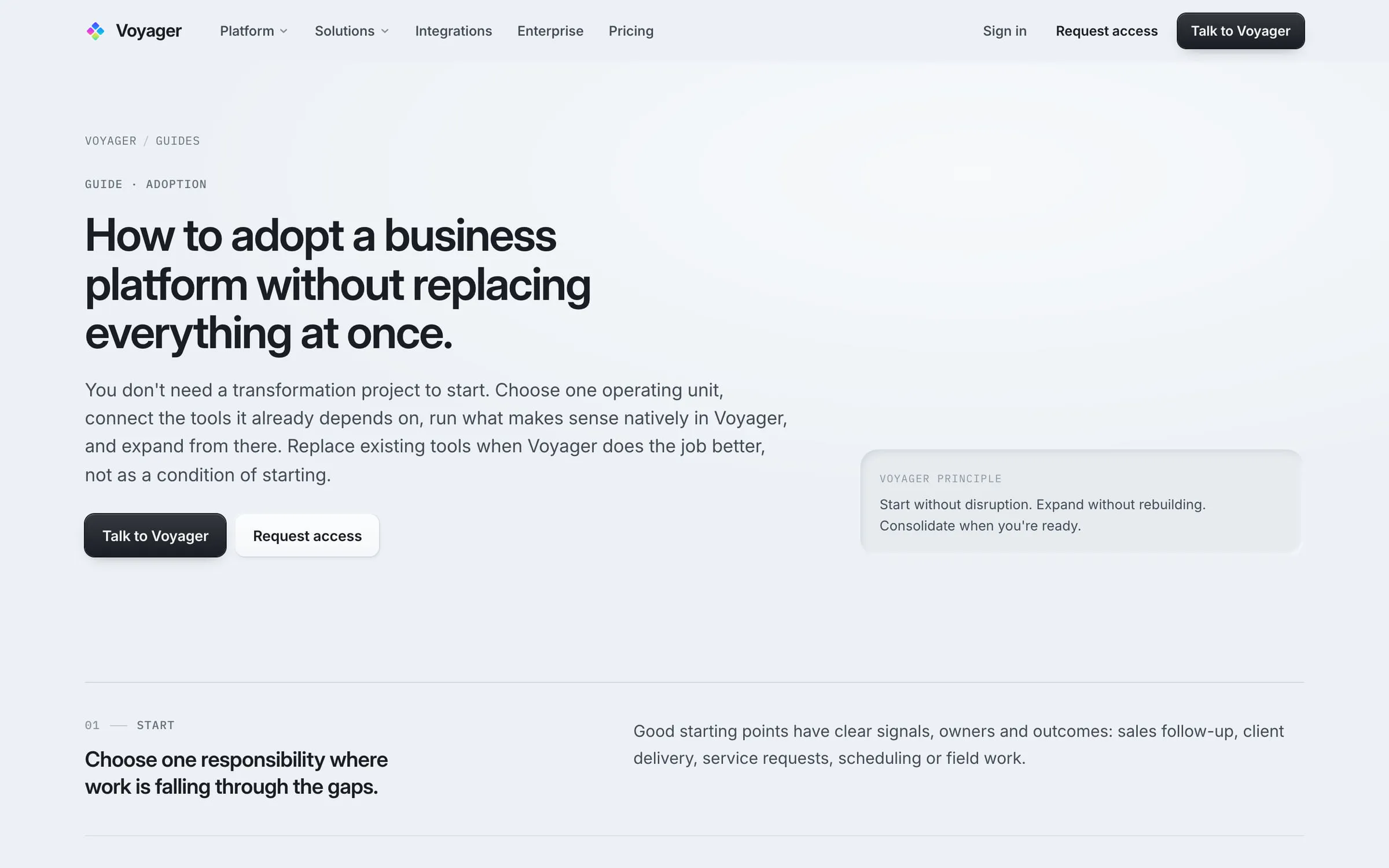
A restrained, light interface language: generous whitespace, a disciplined type scale and product surfaces as the primary imagery. Product surfaces on the site are presented in the application's own interface language rather than stock illustration, so the website and the product read as one company.

Engineering and implementation

Built on Next.js with the App Router and React 19, with important content server-rendered and statically exported at stable canonical URLs. Sitemap, robots rules and route-level Open Graph and social images are generated from the application itself.

The verification pipeline type-checks the project and runs an automated audit of call-to-action routing before every build, so a renamed route cannot silently break a conversion path.

Search and content

Search and AI-assisted research both depend on crawlable, specific content. Every capability, comparison and guide page is server-rendered text with its own canonical URL, organized so each page answers a distinct evaluation need instead of competing with its neighbors.

Key functionality

  1. Product cockpit hero

    A faithful representation of the working interface, work queue, approvals, capacity and an inspector with evidence, replaces abstract hero imagery.

  2. Capability domains

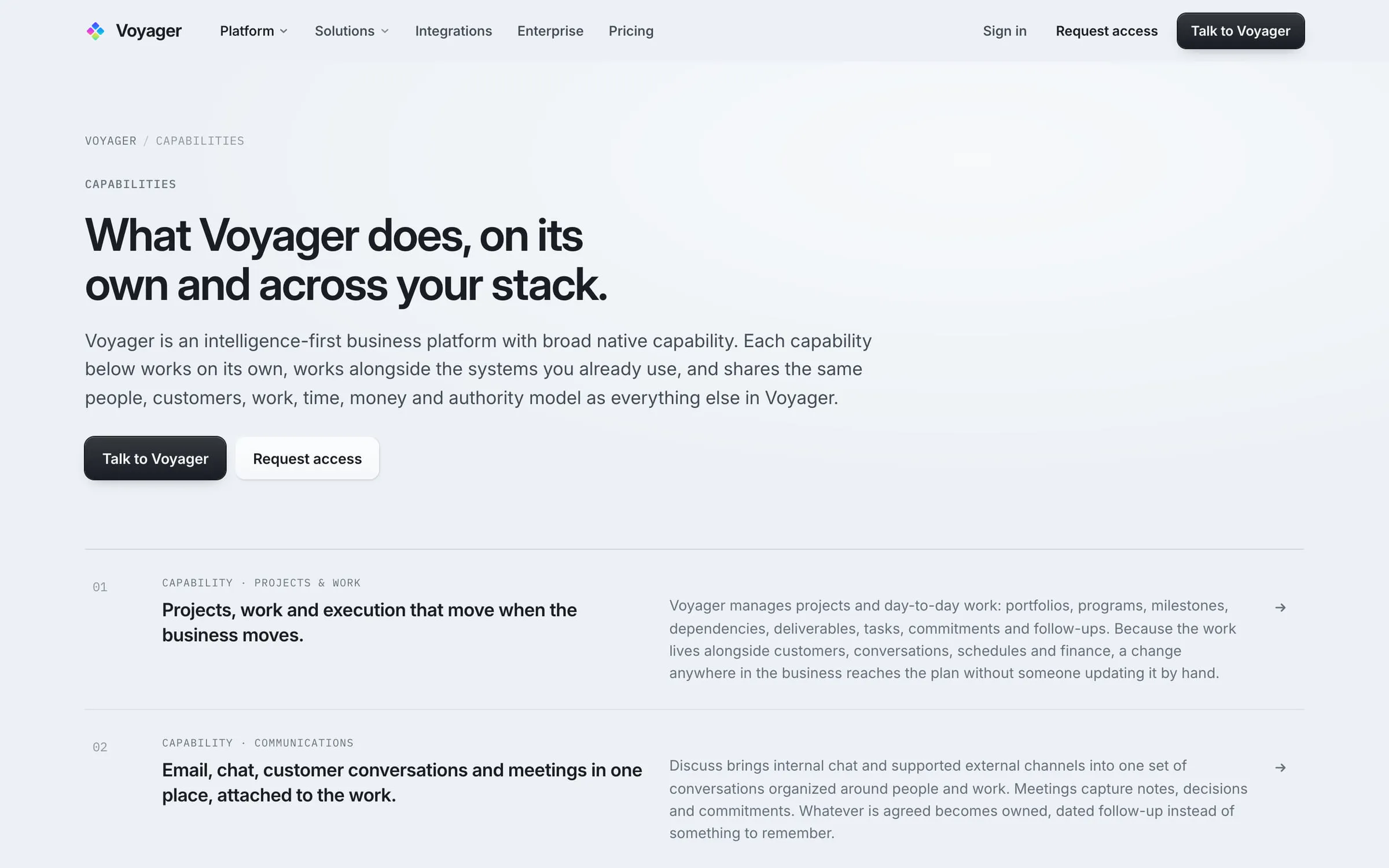
    Each operational domain has its own page explaining what Voyager does alone and alongside existing systems.

  3. Evaluation guides and comparisons

    Long-form guides and comparison pages written around the questions buyers raise during evaluation.

  4. Audience editions

    Enterprise, personal and family routes, each with its own framing and path to get started.

Selected screens

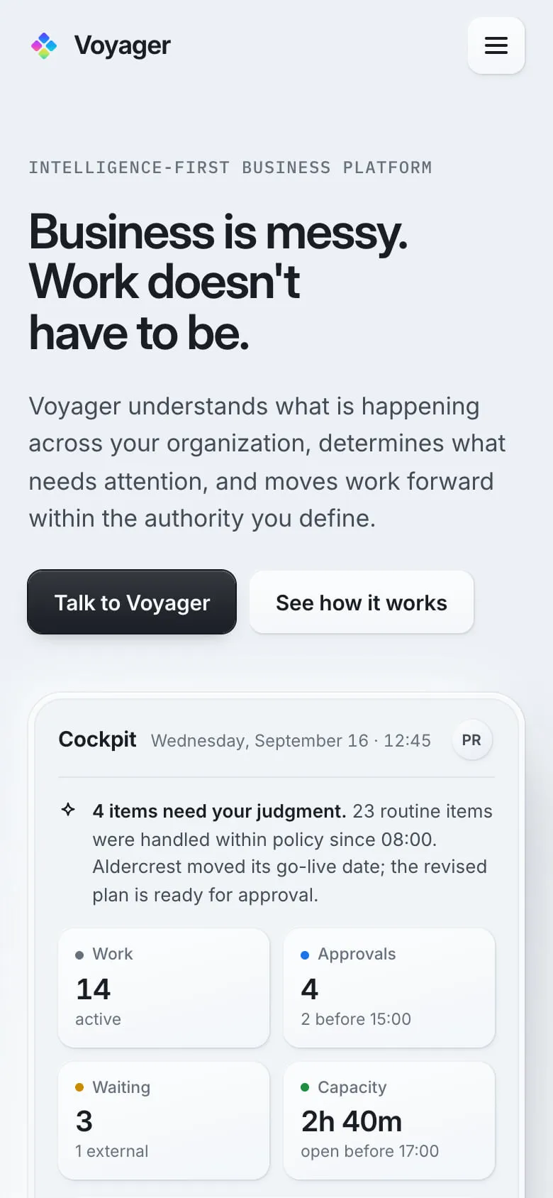
Voyager homepage on a phone, with the cockpit summary cards stacked below the headline.

Responsive and mobile behavior

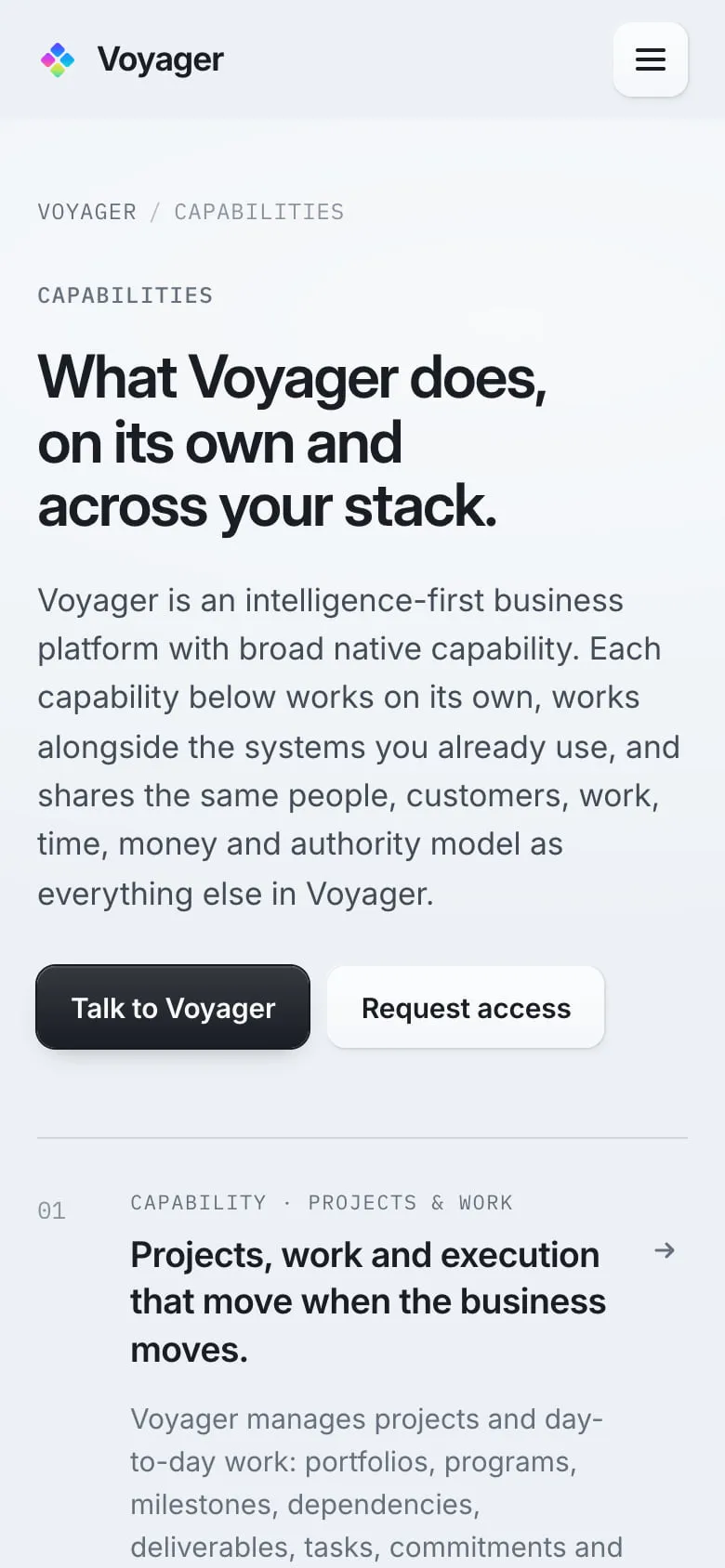
On phones the cockpit is recomposed rather than shrunk: headline and calls to action first, then the most important signals, work, approvals, waiting items, capacity, as summary cards that stay legible at a glance.

Ongoing operating model

The site is operated continuously. Product vocabulary, capability depth and route structure are revised as the platform evolves, through the same governed release process used for every Colorbull property.

Results and evidence

We publish verifiable implementation evidence. Where measured business outcomes are not available for publication, we do not substitute estimates.

  • Server-rendered knowledge layer

    Capability, solution, comparison and guide content ships as crawlable HTML at permanent canonical URLs.

  • Generated discovery infrastructure

    Sitemap, robots rules and route-level social images are produced by the application rather than maintained by hand.

  • Guarded conversion paths

    A call-to-action routing audit runs in the verification pipeline before each build.

  • Product-first imagery

    The site shows representations of the working interface instead of abstract or stock illustration.

Visit Voyager (opens in a new tab)
Next projectTouchline Systems

More work

See what we would change.

Start with a focused assessment of the property you have now. We look at the experience, search visibility, technical condition, conversion path and the opportunities that matter most before recommending scope.